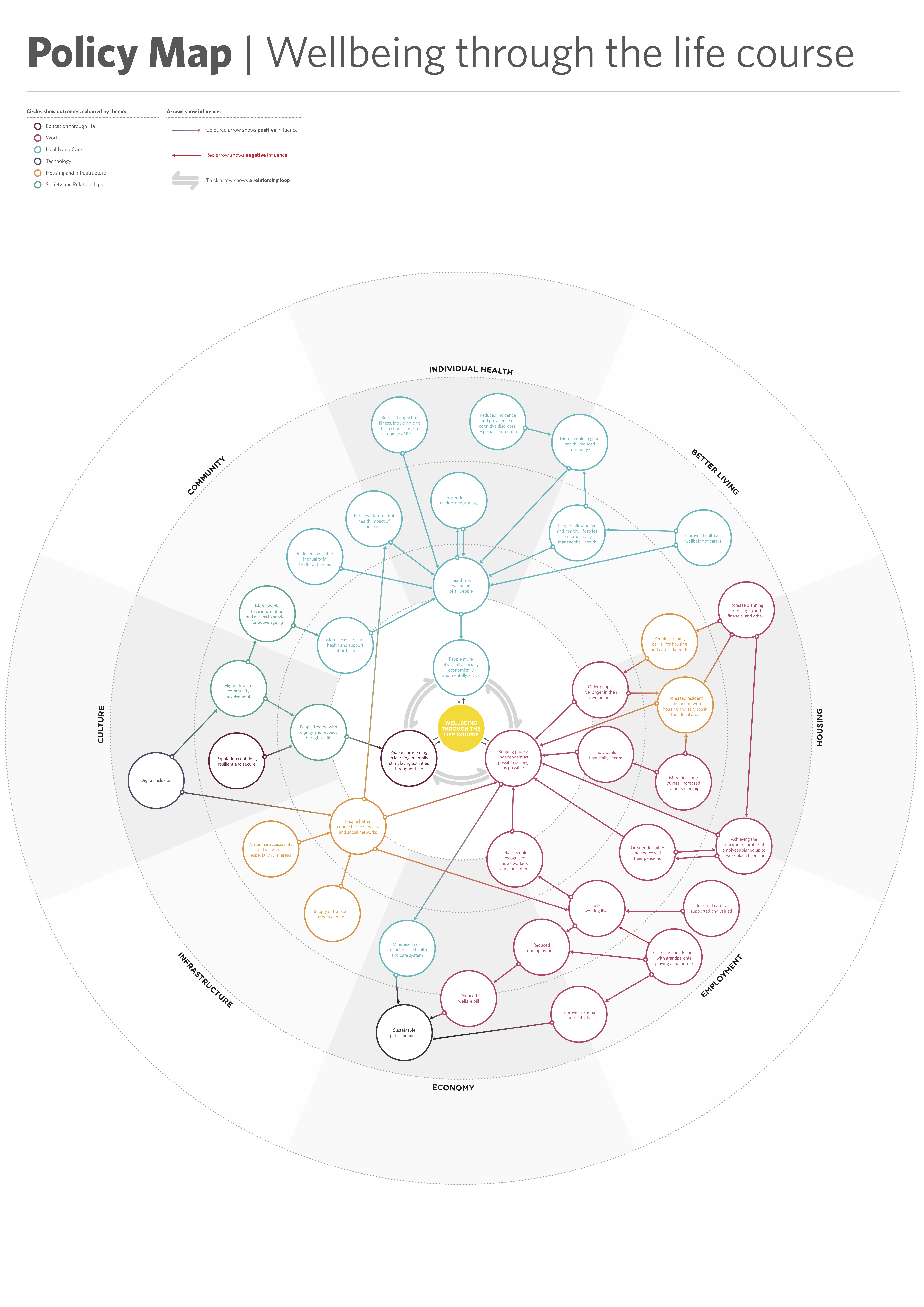
Policy Map Visualisation
As part of our project for Policy Lab and Government Office for Science’s Foresight Team, on the Future of Ageing, we visualized a rough map, ‘Wellbeing Through The Life Course’ showing how different policies relate to an ageing population into a clearer format, employing the same visual techniques as the evidence cards. The policies were grouped by area and the areas were categorised by colour. The visualization took on the form of a poster. The poster was used in the Future of an Ageing Population workshops where participants were invited to add policy ideas to this relational policy map.
